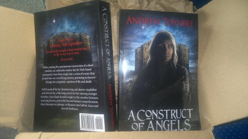
It’s heeee-re! It’s really here!
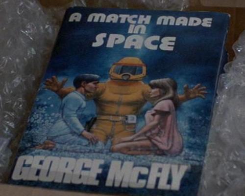
I’m as proud as George McFly when HE opened his box in 1985;
(George McFly is a fictional character and wannabe author who was featured in ‘Back to The Future’ in case you don’t remember the 1980’s)
I can report several parallels with George’s story…we’d both been writing since we were at school, we’d both suffered similar abuse from our peers and we’ve both been accosted by time-travelling versions of our own sons. Except that mine hasn’t happened yet…but I’m sure it will. 🙂 It’s bound to. That’s how time-travel works, right?
Ahem.
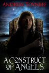
Anyway, back to the main event – the paperbacks. Actually, they were so large, I thought CreateSapce had accidentally sent me hardbacks. At 500 pages long, ‘Construct’ is no lightweight – but it would have weighed in at 700 pages if I hadn’t made the decision to lose the last three chapters from the original draft and recycle that ending into the (proposed) third book.
I can report that the print quality is top-notch. The cover is of good quality, printed on at least 200gsm card – possibly thicker.
(You’ll guess from the above that I’m not an expert in this field!)
However, it feels as good as any ‘real’ paperback and doesn’t feel as if it’s going to disassemble itself the first time it’s opened. Quite how they put such a small number of books together so well, I’m uncertain. I imagine that there is a large workshop beneath one of Amazon’s warehouse, complete with chutes and steam-driven conveyor belts manned by elves who sing jolly tunes as they lovingly construct the books.
Perhaps I’m wrong – but can anybody prove it? 🙂
When I was populating the CreateSpace template with my MS, I went for a 6×9 layout, black text of cream paper and a size 11 font – Book Antiqua – which was the default font of the template. This resulted in a pleasant and easily readable text.
Even the image file that CreateSpace flagged up as too low-resolution (less than 300 dpi) turned out to be fine. Since it was only an image of a character’s shaky handwriting, it didn’t concern me. I’d have shows it to you, but it’s a major spoiler. I imagine that a photograph of a similar resolution might have turned out poorly, but as someone commented recently on a previous post, ‘if it looks fine on the screen, it’ll probably be fine in the book.’
A quick flick through the book revealed that all was well, although one of those irritating spaces had managed to make an appearance at the bottom of one of the pages. *Fumes quietly to self at having missed it.* I also felt that having chapters begin on the left-hand rather than the right-hand page looked wrong. Unfortunately, this was the way that the text fell, so I will have to make some changes in that department.
My bio, now that I see it in print, reveals more about me than I’m comfortable with, so I’ll be trimming it slightly. Once I’ve had a chance to read the rest of the book, I may find other aspects that I’d prefer to adjust, but that’s something for another day.
So, a few minor tweaks required, but not a disaster by any means, but this all goes to prove that it was a wise move to follow CreateSpace’s advice and order proof copies and not just trust that I had everything right first time.
If you’re thinking of using CreateSpace, I’d be happy to report that it’s been a straightforward, happy experience – aside from my shenanigans with the formatting, although that is an issue with Word and may possibly have been a left-over from using Word to assemble my story in the first place. Those wise writers who utilise Scrivener may not have this problem.
So…off I go to a dark corner where I can read my 500 pages without interruption.
Yeah, like that’s going to happen! 😀
.
In the meantime, whether you prefer pixels or pages,
Write On!





Jun 03, 2013 @ 19:44:36
Congratulations! Even from the picture, it looks fantastic. Did you go with a glossy cover, or a matte finish? The small glares from a flash make me think glossy, but I wasn’t sure. Anyway, thanks for documenting this process for us. It’s been extremely helpful! 🙂
LikeLike
Jun 03, 2013 @ 20:19:37
Kisa
I don’t actually remember CS asking me if I wanted matte or glossy. Odd. Must have slid around that in my desperation to click ‘send’. As it turns out, glossy looks good. I took a dozen pics, some with flash, some without and as you’re pointed out, the pic I chose with the little bit of glare (some were waaay more glary) shows off that it’s gloss.
I’m glad that it was of some help – are you tempted now? 😀
LikeLike
Jun 03, 2013 @ 21:02:23
I am. I am indeed. Of course, I have to finish a manuscript before I can pursue publishing it. 😉
I could be wrong about the options too. I might be confusing my research on Lightning Source with Createspace. Maybe they only do glossy. Regardless, it looks good!
LikeLike
Jun 05, 2013 @ 17:20:24
Keep us all posted, Kisa. It’s worth all the hard work (gnashing of teeth, biting of nails and tearing out of your hair…not to put you off!).
LikeLike
Jun 03, 2013 @ 09:47:44
Fabulous stuff!! That is so exciting. Great to see the book in print at long last – you must be chuffed.
LikeLike
Jun 03, 2013 @ 11:50:45
Chuffed – to bits! So close to being able to list it for sale now…so close.
LikeLike
Jun 03, 2013 @ 08:23:16
Congratulations! It must be great to have your own book in your hands 😀 Good to hear that Createspace is performing to standard. They sound lovely!
LikeLike
Jun 03, 2013 @ 11:52:35
It turned out to be a straightforward process. As long as you have all the information to hand before you begin (MS, banking details, preferred size), it’s relatively smooth.
LikeLike
Jun 03, 2013 @ 06:03:04
This is great. I’m so glad I hung around for part III. I’ve been asking around quite a bit on Create Space and getting really good feedback. I am leaning to the tipping point that way. Thanks for these great posts.
LikeLike
Jun 03, 2013 @ 11:53:50
There will be one final post on this subject that will summarise and tie up any loose ends – for everyone who is thinking of taking the plunge. Glad I was able to help.
LikeLike
Jun 03, 2013 @ 00:27:23
Yeah, yeah! Congratulations! 🙂
LikeLike
Jun 03, 2013 @ 11:54:29
😀 TY. It was worth it – and all the worrying…well, it really wasn’t!
LikeLike
Jun 02, 2013 @ 23:26:28
Wow!! Congrats on your book baby!!!
LikeLike
Jun 03, 2013 @ 11:55:46
Yay! It’s been a long time coming. Well, from the time I finished my MS until now, it’s ONLY been seven months, but Jeez! That seems like a lifetime ago! 😀
LikeLike