
Following on from my previous post, I have moved a little further along the road towards creating my first-ever paperback *shivers as a life-long dream seems possible*.
Firstly, I set up a CreateSpace account alongside my Amazon author’s account, then proceeded to navigate CS’s user-friendly set-up menu. I was offered a plethora of differing sizes for my physical book, and after having discussed this with other bloggers, I finally settled on the 6×9″ format.
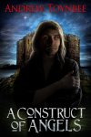
I then downloaded the novel template (6×9″), after which ‘A Construct of Angels’ (already formatted in Word) was pasted into the template so I could make any adjustments to the layout.
Here’s where the gnashing of teeth began…
When I scrolled through the virtual book (complete with flipping pages feature…it’s looking more like a real book already), I found a problem. Not Major by any means, but nether was it minor.
For some reason, my the formatting contained within my original layout caused the whole MS to leave random (it seemed) spaces at the bottom of every page, giving it a chewed-off appearance . I had to spend three nights inside the Word document copying and pasting text from the top of the previous page into the end of the text from the one above. Sometimes there was only one blank line; other times there were five.
Weird. This was the point where I wondered if I should finally make the move to Scrivener…
Patience required, definitely. Still, I wanted it to be right, so I put in the time to set it all up properly.
Save, copy, paste and check the format on CS once again – more flicking through virtual pages with a beady eye on the spacing.
Then the next problem reared its head. I use two images within my text. CreateSpace’s automated formatting checker decided that the resolution of these images was too low to print properly. Now, this is an image of some handwriting – some very poor handwriting, as it happens…if you think ‘spider that scuttled through a puddle of ink’ then you won’t be far off. Yes, it’s ncessary to the plot.
Guys, it doesn’t NEED to be hi-res.
I DID try to change the resolution using Paint and then PhotoImpact, but to no avail. I can live with it. The question is, will CreateSpace let it pass?
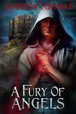
The next stage is the cover.
I sent the details of the size, page colour and page count to Ravven who has tweaked the original artwork to match. Thanks, Ravven!
Now that the final piece is in place, and CreateSpace is happy with the format (low-res image notwithstanding), I have ordered the proof copy from the US printers (the proof has to come from the US, but subsequent purchased copies are created in the UK for UK buyers) and wait for its arrival with teeth gound and breath held.
The tension mounts…


May 28, 2013 @ 20:39:37
Andrew, a couple of techie things (and of course congrats on the actual product itself). Some ideas for your problem of “random white spaces”.
First, this could be because it is very tempting for a user who knows they want (say) A4 to just manually use the Return key to space something out. This has a different effect than using the “insert page break” command, the latter being more accommodating to page size changes.
Or, you could check your “widows and orphans” settings. Better authorities than I still debate which is a widow and which an orphan, but they refer to Word’s tendency to avoid having single lines of text at start and end of pages. You may find a better effect by allowing single lines, in which case white space is reduced.
You have already found that it should be possible to change picture resolution – but you have to be a wee bit careful you don’t simply scale down the physical dimensions as you scale up the res. It is usually possible to change res with Save-As type commands, but do keep an eye on the inches/centimetres your picture will occupy…
The whole journey sounds, to say the least, interesting…
LikeLike
May 28, 2013 @ 22:34:22
Richard
Thanks for the pointers. I don’t think that was the cause of my white spaces as they didn’t occur in the same places in the original MS and the CreateSpace document. That was down to the 6×9″ template, which kindly rearranged all my breaks as well as inserting increasingly larger white areas at the bottom of each page.. I HAVE managed to fix these spaces, but it’s made me realise that Word isn’t really suitable (this was the final straw) for professional writing – something that other bloggers have been saying for years. 🙂
But thanks for the Word info – I shall investigate.
LikeLike
May 29, 2013 @ 05:50:59
Andrew, I agree about Word and its frustrations when you’re not dealing with the right page layout from the start. I always just use straight HTML these days, but then I’m geeky enough to be happy with that!
LikeLike
May 29, 2013 @ 21:21:00
I find it hard to proof read. Got my debut novel in HTML using iEdit but I can never read it without hiccupping over the format. 🙂
LikeLike
May 28, 2013 @ 17:53:52
Yay! You did it! You have wayyyyy more patience than I do.
LikeLike
May 28, 2013 @ 17:58:44
No I don’t, No I don’t *continues pacing as Wednesday draws closer* The proof books will arrive (if the schedule is accurate) tomorrow – except that I am currently over 350 miles from home…so I won’t get to see them until Friday. Aaaargh. *chews fingernails*
Patient? 😀
LikeLike
May 26, 2013 @ 20:41:42
I’m anxious to read about how you will rate the quality of the ‘real’ book you get from CreateSpace. I’m leaning that way for the 2nd novel – but the quality of the 1st is high and I sure wouldn’t want to step down in that department.
LikeLike
May 27, 2013 @ 00:00:12
I’m also anxious – waiting to see how the quality matches up to an ‘industry’ book. Fortunately, there are no images besides the cover and the aforementioned handwriting .png image, so I’m hoping that the text is of good quality. And that the binding is sound.
LikeLike
May 26, 2013 @ 16:13:03
Problems aside, well done, sir! I advise you to video record yourself opening the box and pulling out your proof copy, so we can all see the reaction in real-time.
LikeLike
May 26, 2013 @ 23:56:56
Eeeek! Be seen in a video? Having already seen myself on the BBC, I decided that I have the ideal face for radio…and a voice suitable for use on Facebook. 🙂
But I had planned to post a photo of the paperbacks and their box, never fear!
LikeLike
May 26, 2013 @ 23:59:16
I will fear if I want to fear, sir!
LikeLike
May 27, 2013 @ 00:05:17
Then fear fair, Ms. P!
LikeLike
May 26, 2013 @ 13:49:48
Just wondering; would pasting unformatted text in the first place have solved the CS space problem? I would like to know in case I need to self pub.
LikeLike
May 26, 2013 @ 23:54:41
John; I couldn’t find a font that looked like bad handwriting or I would have used this method as you suggested. I had to create the image of the scribble as a .png file – but it was too low-res.
Do you know of a font that could have helped?
LikeLike